Eyes Openers
  • World News
  • Business
  • Stocks
  • Politics
  • World News
  • Business
  • Stocks
  • Politics

Eyes Openers

Category:

Stocks

3 Stocks to Watch While Everyone’s Staring at NVIDIA
Stocks

3 Stocks to Watch While Everyone’s Staring at NVIDIA

by May 24, 2025

This week, while everyone else is focused on NVIDIA Corp. (NVDA), we will focus our attention on stocks with earnings that may get overlooked.

We’re watching a different group of stocks heading into earnings: Okta, Inc. (OKTA), AutoZone, Inc. (AZO), and Salesforce.com, Inc. (CRM). OKTA and AZO are making new highs as they head into their earnings call, while CRM is struggling.

Let’s break down the best risk/reward set-ups as we kick off the week.

Okta, Inc. (OKTA): Volatility Now, Potential Later

Okta’s stock price broke out to new 52-week highs a week before it posts its quarterly numbers. The cybersecurity company has experienced extreme volatility after posting earnings. In the last three quarters, the stock saw some pretty big swings—up 24.3%, up 5.4%, and down 17.6%. Its average price change post-earnings is +/-10.2%.

Technically, I love this setup. Let’s look at a five-year daily chart.

Shares have broken out ahead of earnings and have a lot to reverse. If we see weakness after results, there are several support areas where we would want to enter the stock with favorable risk/reward. The first strong support area is between $115/$118, an old resistance level that the stock just eclipsed. Old resistance could act as new support and provide an opportunity.

Outside of recent weakness due to “Liberation Day,” OKTA’s stock price has outperformed its peers and held key moving averages. Use levels just below the 50-day moving average around $110 as a near-term stop if $115 doesn’t hold.

To the upside, there is much to reverse and targets of $150 to $160 are attainable. If you’re a longer-term investor, the downtrend is broken and the bulls are back in charge.

AutoZone, Inc. (AZO): Riding Steady 

The retail leader in automotive replacement parts and accessories, AutoZone, Inc. (AZO), continues to rise, slowly and steadily, despite market volatility. The stock price is up 20% year-to-date, and we hope to add to those gains when they report on Tuesday morning.

One thing that has helped AZO’s continued growth is that the average car is roughly 12 years old. Consumers are investing more in maintenance and repairs instead of purchasing new vehicles. And with tariffs, buying a new car becomes more expensive, which benefits the car repair and maintenance business.

Let’s look at that long-term uptrend on a weekly chart going back five years.

The stock is a juggernaut. It has ridden the 50-week moving average consistently since Covid. It is in a beautiful uptrend and made new highs again just last week.

While the trend itself appears a tad extended above its averages, any trip back towards its recent uptrend line gives investors a strong entry point, with downside risk towards its 50-week moving average.

It’s also the best in class when compared to its top competitors, such as O’Reilly Automotive (ORLY) and Advanced Auto Parts (AAP). When looking at strong uptrends in a challenging environment, it’s best to find the best in class, and AZO continues to be just that. The trend continues to be the investor’s best friend.

Salesforce (CRM) Hits a Crossroads

A year ago, Salesforce (CRM) shocked investors with a revenue miss for the first time since 2006. This resulted in the stock price dropping 20% (red box in the chart below). It marked the stock’s low point, as it rallied as much as 74% over the next seven months. It now sits in the middle of a wide year-long range and is poised to move again.

Which way will it go? To examine that question, let’s look at the daily chart of CRM.

Technically, shares are at a crossroads. Shares dropped 37% from their December peak after forming a double top. It just broke its near-term downtrend from its post-Liberation Day lows, experiencing a 28% rally, but paused right at its 200-day moving average.

Momentum appears to be negative. The Moving Average Convergence/Divergence (MACD) has formed a bearish crossover, and shares failed to eclipse the 200-day. Shares are down -18% for 2025, underperforming the tech sector and the S&P 500. CRM sold off late Friday, hitting its 50-day moving average, on news that it’s in talks to acquire Informatica.

If you’re thinking of buying CRM, you may want to hold your horses. Watch the 50-day moving average around $270 to see if it can hold. On strength, look for confirmation and a close above the $295 level for an all clear that momentum has finally shifted in favor of the bulls.

Final Thoughts

OKTA, AZO, and CRM are thoughtful plays based on technical trends and real-world fundamentals. OKTA and AZO could have favorable risk/reward setups. As for CRM, add it to your ChartLists and monitor it regularly.

May 24, 2025
What Happens When the S&P 500 Breaks Below Gap Support?
Stocks

What Happens When the S&P 500 Breaks Below Gap Support?

by May 23, 2025

My main question going into this weekend was, “Will the S&P 500 finish the week above its 200-day moving average?”  And while the S&P 500 did indeed finish the week above this long-term trend barometer, our main equity benchmark is now within the gap range from earlier this month.

We’ll get to that crucial S&P 500 chart a little later, but first, I’d like to explain why gaps matter, why the price action post-gap is so important, and then apply these lessons to the SPX.

The “Gap and Run” Scenario Suggests an Influx of Buyers

One of two things tends to happen after a gap higher within an uptrend phase.  The first scenario, which I call a “gap and run” pattern, is when additional buyers come in to push the price even higher.

Microsoft Corp. (MSFT) features this gap and run pattern, with the gap higher on their Q1 earnings report followed by an additional appreciation in price.  Basically, investors are not afraid to accumulate more MSFT, even after the stock gapped up from $395 to $430 overnight.

Did you catch our recent webcast, “Sell in May 2025: Seasonal Strategy or Outdated Myth?”  We looked at the performance in May-June-July since the COVID low, then made a comparison between 2025 and the first half of 2022, when a break below the 200-day moving average was a sign of much further deterioration to come.  Check out this excerpt on our YouTube channel!

Shares of Howmet Aerospace (HWM) demonstrated a similar gap and run pattern recently, although this example is perhaps even more significant because the gap took the price to a new all-time high!  Again, we can see that additional buyers are coming in and accumulating more HWM, fueling further gains after the gap.

The “Gap and Fail” Pattern Shows a Lack of Willing Buyers

Sometimes a chart will show a very different path after the gap, forming what I’ve termed a “gap and fail” pattern.  Unlike the previous examples, here you’ll see that a lack of willing buyers causes the stock to quickly reverse lower into the range of the price gap.

In the case of semiconductor producer Monolithic Power Systems (MPWR), the gap higher earlier this month was followed by two additional up days which propelled the stock above its 200-day moving average.  This short-term pop higher was followed by a sudden downside reversal, representing an exhaustion of buyers after the upside gap.

First Solar (FSLR) is demonstrating a similar pattern to MPWR, with a gap higher which pushed the stock just above the 200-day moving average to test the 38.2% Fibonacci retracement level.  A couple days later, FSLR was back below the 200-day moving average, followed by further deterioration which eventually closed the gap from earlier in May.

The S&P 500 Could Test Its Own Gap Support

So what do those example charts have to do with the S&P 500?  Well, the SPX traded higher for about a week after the upside gap in early May.  We’ve drawn a green shaded range to highlight the gap from around 5725 to 5780.  This gap includes the 200-day moving average and also lines up with the late March swing high.

I see the S&P 500 as in a constructive pattern as long as it remains above this price gap range.  If we can see an upswing after this week’s pullback, then this could just be a pause within a broader recovery phase for the S&P.

On the other hand, if we see any further price weakness from the major benchmarks next week, then the chart of the S&P 500 will start to look pretty similar to other “gap and fail” charts that confirm a lack of willing buyers.  If we do see that downside follow-through next week, we’d expect further deterioration to the 5500 level, representing a 50% retracement of the February to April selloff phase.

RR#6,

Dave

PS- Ready to upgrade your investment process?  Check out my free behavioral investing course!

David Keller, CMT

President and Chief Strategist

Sierra Alpha Research LLC

marketmisbehavior.com

https://www.youtube.com/c/MarketMisbehavior

Disclaimer: This blog is for educational purposes only and should not be construed as financial advice.  The ideas and strategies should never be used without first assessing your own personal and financial situation, or without consulting a financial professional.  

The author does not have a position in mentioned securities at the time of publication.    Any opinions expressed herein are solely those of the author and do not in any way represent the views or opinions of any other person or entity.

May 23, 2025
Applying Key Ratios to the Broader Market Surge: Are We at the Threshold of a New Trend?
Stocks

Applying Key Ratios to the Broader Market Surge: Are We at the Threshold of a New Trend?

by May 23, 2025

The financial media is flooded with commentary questioning whether the current rise in stock indexes is sustainable enough to mark the beginning of a new bull market. In short, have we gotten out of the woods, or are we in a clearing with more uncertainty to come?

There are many angles through which this stock market environment can be interpreted. Here, we’ll focus on a set of StockCharts Market Summary tools that provide insight by way of comparative performance: in short, using ratios to evaluate the qualitative dimensions of stock market participation.

This article is based on a simple market axiom: bull markets typically don’t thrive on defensive sectors. Bull markets reflect confidence in long-term growth prospects. Defensive sectors, in contrast, are where investors run to when they’re not confident about the economy.

Key Offense vs. Defense Ratios to Watch Right Now

With that said, let’s look at the Market Summary’s Key Ratios > Offense vs Defense panel. Here are the main ratios:

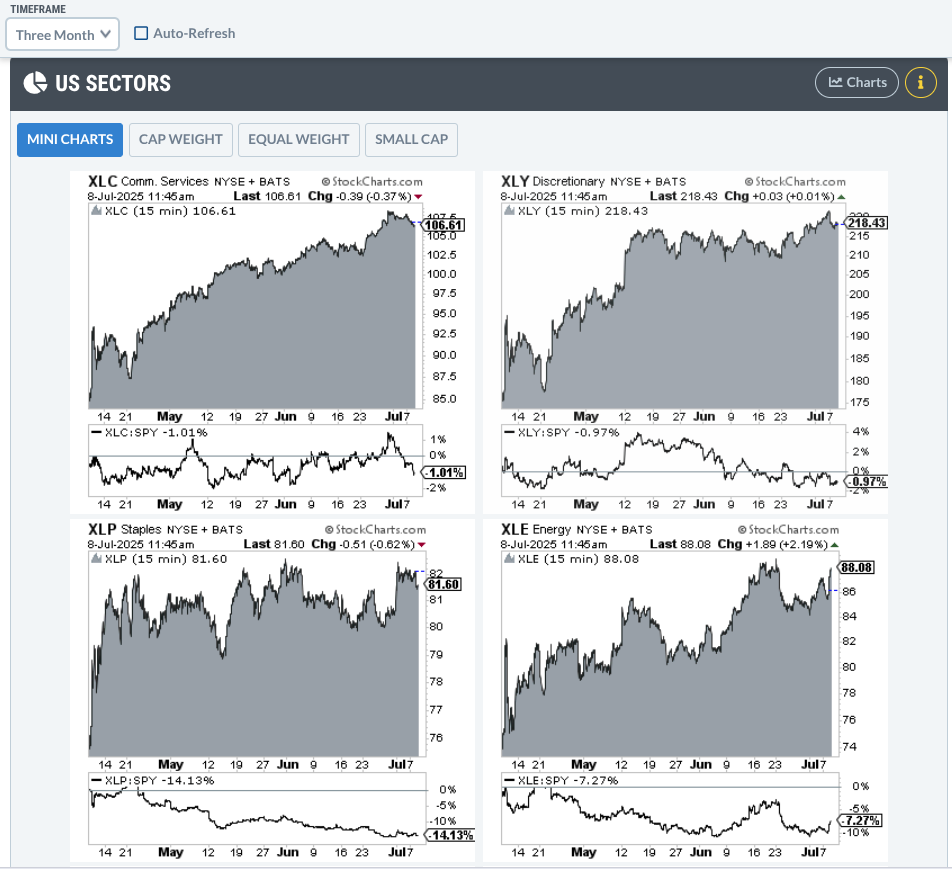
Discretionary vs. Staples. Consumer Discretionary Select Sector SPDR Fund vs. Consumer Staples Select Sector SPDR Fund (XLY:XLP). This ratio reflects where investors believe consumers are likely to spend; toward discretionary items like entertainment, or toward essential goods like food and household products. Since consumer spending accounts for roughly 70% of U.S. GDP, this makes the XLY:XLP ratio a valuable indicator of broader economic sentiment.Technology vs. Utilities. Select Sector SPDR Fund vs. Utilities Select Sector SPDR Fund (XLK:XLU). This ratio tracks whether investors are leaning into a risk-on preference for growth and a low-rate environment, or leaning into a more defensive posture, where utilities tend to outperform.Biotech vs. Health Care. SPDR S&P Biotech ETF vs Health Care Select Sector SPDR Fund (XBI:XLV). This ratio highlights the difference between speculative risk-on vs risk-off. Biotech is among the most speculative and riskiest industries within all 11 sectors.Hotels vs. Utilities. Dow Jones US Hotels Index vs Dow Jones US Utilities Index ($DJUSLG:$DJUSUT). This ratio compares cyclical, consumer-driven hotel stocks (a classic risk-on sector) with defensive, recession-resistant utilities.

This chart lays it all out:

FIGURE 1. CHART OF MARKET SUMMARY RATIO LIST.  All of the ratios are in alignment, with a tilt toward a risk-on posture.

XLY:XLP is pulling back from a steep recovery. The Quadrant Lines gauge the strength/weakness of the ratio’s retracement. If the decline stays within the first top two quadrants, then the case for a risk-on recovery within this segment of consumer spending becomes more evident.

As for the other ratios, note the relation of price to near-term resistance (see blue dotted line). Like XLY:XLP, hotel spending vs. utilities appears poised for a breakout, so watch this space closely.

To stretch the Dow Theory tenet that stock indexes must confirm each other,  you can also transfer that idea to the domain of offense vs defense indexes. The XBI:XLV ratio has already broken above the spread’s near-term resistance, suggesting that risk-on may be a go; even moreso tech vs. utilities (XLK:XLU).

Discretionary Stocks in Focus: Can XLY Hold the Line?

Since spending plays a clear and immediate role in GDP calculations, the focus will be on discretionary vs. staples spending. In light of this, take a look at this daily chart of XLY.

FIGURE 2. DAILY CHART OF XLY. Discretionary stocks are pulling back after an impressive run capped off by a strong runaway gap.

XLY is pulling back slightly after a sharp gap up, having recently hit a local high near $218. Combined with Price Channels to highlight swing highs and lows, the green-shaded area marks the breakout range. While this zone may offer some support, don’t be surprised if XLY retraces further.

A more favorable and (historically) resilient support level lies in the yellow-shaded range between $189 and $192. A drop below this zone would signal further weakness, despite the presence of additional support around $177, shaded in red.

Momentum-wise, the Relative Strength Index (RSI) is oscillating just below the 70 level, suggesting there’s still room for an upward move before entering overbought territory.Volume-wise, the Accumulation/Distribution Line (ADL), overlaid above the price chart, indicates strong accumulation, a bullish signal reflecting sustained buying pressure.

Staples Show Weak Momentum: What XLP’s Flatline Means

Now, let’s compare this to XLP which, at a glance, is both volatile and flat. Here’s a daily chart.

FIGURE 3. DAILY CHART OF XLP.  Staples may be performing relatively well, but there’s no overarching trend in sight.

Over the last year, the secondary trends show a series of bullish/bearish back-and-forth movements, but, cumulatively, there’s no indication that XLP is poised for a major breakout to the upside. XLP may present a favorable market for swing traders looking to fade short-term tops and bottoms, but as for long-term growth, there’s little evidence for a bullish or bearish case.

Momentum-wise, the RSI is more or less flat, hovering at the 50-line with no real directional movement.Momentum-wise, the ADL shows accumulation and distribution on par with the price movement. There’s nothing to suggest that XLP is experiencing any degree of buying or selling pressure to push the price higher or lower.

How to Apply These Ratios to Your Market Outlook

Confirm the broader narrative. If you believe the broader market is poised to move beyond recovery, then the ratios, all of which favor a risk-on posture, should serve as a tentative green light.

Furthermore, use pullbacks to assess investor conviction. Volume and momentum-based indicators can help you gauge whether there’s real conviction behind the swing. Other indicators you can use to gauge the broad market indexes are all featured in my article on Dow Theory.

At the Close: Are These Ratios Signaling a Real Market Shift?

If these risk-on ratios continue to hold or break higher, they may offer early confirmation that this market isn’t just bouncing, but rather building. Remember that defensive sectors don’t lead bull markets. So far, the offense is making a compelling case; monitor the ratios from the Market Summary page to help guide you through the market’s uncertain environment.

Disclaimer: This blog is for educational purposes only and should not be construed as financial advice. The ideas and strategies should never be used without first assessing your personal and financial situation, or without consulting a financial professional.

May 23, 2025
Moving from Thrust Signals to a Bull Market
Stocks

Moving from Thrust Signals to a Bull Market

by May 23, 2025

The bullish signals stacked up in April and May, but most long-term breadth indicators are still bearish. SPY and QQQ showed signs of capitulation in early April and rebounded into mid April. A Zweig Breadth Thrust triggered on April 24th and several other thrust indicators turned bullish in May. We also saw SPY and QQQ break their 200-day SMAs. TrendInvestorPro is tracking these signals and relevant exit strategies.

These are bullish indications for large-caps and, perhaps, stocks in the top half of the S&P 500. However, I would not call it a bull market until participation broadens. The chart below shows the S&P 500 EW ETF (RSP) and S&P MidCap 400 SPDR (MDY) moving back below their 200-day SMAs. The S&P SmallCap 600 SPDR (IJR) never came close and remains a big laggard.   

The bottom window is perhaps the most telling. It shows the percentage of S&P 1500 stocks above their 200-day SMAs. This long-term breadth indicator did not cross above 50% in May. Except for a 1-day dip on January 10th, this indicator was above 50% from December 2023 to February 2025 (bull market). It broke below 40% on March 10th and has yet to fully recover (bear market).

At the very least, a move above 50% is needed to show broadening participation worth of a bull market. This is how the market moves from bullish thrust signals to a bull market.  Until such a move, we are still in bear market mode and risk remains above average for stocks. Note that the S&P 1500 includes large-caps (500), small-caps (600) and mid-caps (400). Around 2/3 of components NYSE stocks and 1/3 Nasdaq stocks. It is a truly representative of the broader market.

Exit strategies are just as important as entries. The Zweig Breadth Thrust and the 5/200 day SMA cross provided entry signals in April and May. We now need an exit strategy. TrendInvestorPro put forth exit strategies for both signals and these are updated in our reports. This week we covered the gap zones in SPY and QQQ, long-term breadth signals, big moves in metals and continued strength in Bitcoin. Click here to take a trial and gain full access.

 ////////////////////////////////////////////

May 23, 2025
S&P 500 Slide Explained: What Past Price Action Reveals About Market Dips
Stocks

S&P 500 Slide Explained: What Past Price Action Reveals About Market Dips

by May 22, 2025

On Wednesday, only 4% of the S&P 500’s holdings logged gains — a pretty rare occurrence. Since the start of 2024, this has only happened three other times:

August 5, 2024: The last day of the summer correctionDecember 18, 2024: The Fed’s hawkish cutApril 4, 2025: Tariffs

Let’s recall that major trading lows were etched last August, and again just a few weeks ago in early April. The S&P 500 ($SPX) dropped 10% and 21%, respectively, from its peak to trough both times, with the lows being marked by emphatic capitulation events (April 7 was the real pivot low). The market’s rubber band violently snapped back in the ensuing weeks, both times.

FIGURE 1. PAST LOWS IN THE S&P 500 INDEX. Note the rebounds following the August 5, December 18, and April 4 drops.With the SPX now having gained 20% from the April low, the setup is more like mid-December 2024. The index had just gained 19% from early August through early December and was hovering near 6,100. The FOMC’s actions put a major dent in the calm uptrend.

The S&P 500 didn’t completely crumble after that, spending the next 10 weeks backing and filling. But the market’s character changed, and the cracks eventually gave way to the waterfall decline.

So, what does that tell us about this moment? There’s a clear risk given the one-sided advance the last few weeks, but, with bullish patterns still in play and the $SPX having built up a big cushion, it can afford to back and fill again now. It’s the first gut punch in four weeks, and the market must prove it can absorb it.

Short-Term View of the S&P 500

The drawdown measured from this Monday’s high now stands at -2.4% — most of which happened on Wednesday. Given how small the moves have been over the last few weeks, Wednesday’s big decline hit the 14-period relative strength index (RSI) on the two-hour chart very hard. It’s now at 41, which is very close to the 30-oversold threshold.

Again, we’ve seen the short-term indicator fall to oversold territory several times, even during the market’s upswing from August through December. Seeing that happen again this time wouldn’t be a surprise. If it happens, it will be important to see the ensuing bounce pull the SPX back to overbought territory relatively soon. Remember, we went nearly four months between overbought readings from late January through mid-May.

FIGURE 2. TWO-HOUR CHART OF THE S&P 500 WITH RSI.

S&P 500 Patterns

Despite the sell-off, there was no change in the patterns at work. The two bullish patterns remain in play, with targets of 6,125 and 6,555, respectively. The S&P 500 started Thursday, at about 2.5% above the last breakout zone (5,695).

FIGURE 3. DAILY CHART OF THE S&P 500 WITH BULLISH PATTERNS. Here you see the pattern with a 6,125 target.

FIGURE 4. DAILY CHART OF S&P 500 WITH 6,555 PRICE TARGET.

Monitor the VIX

Not surprisingly, the Cboe Volatility Index ($VIX) gained 15% on Wednesday in response to the market’s sell-off. It remains close to 20, but continues to log higher lows, which has been the trend since late 2024. Indeed, it’s way off spike highs from April, but it’s a trend worth watching.

Let’s recall that the VIX never truly capitulated in 2022, but its trend of higher lows coincided with the equity market’s downtrend. When the SPX logged a true low in October 2022, lower lows in the VIX became evident. This lasted through this past summer.

If the snapback in the SPX turns into a longer, new uptrend, the VIX’s uptrend will morph into a downtrend again.

FIGURE 5. WEEKLY CHART OF THE CBOE VOLATILITY INDEX ($VIX).

Bonds Display Bullish Patterns

The bullish pattern in the weekly 30-Year Treasury yields and 10-Year Treasury yields is crystal clear. An acceleration through the 2023 highs after Wednesday would have an obvious negative effect on stocks.

As discussed before, the equity market has shown it can advance with higher rates, as long as said rates go higher gradually. The intermittent up-moves in rates have been capped for the last two years as well. Thus, stocks have been able to withstand it. That wasn’t the case from January to September 2022, and that’s the potential concern.

FIGURE 6. WEEKLY CHART OF THE 30-YEAR US TRASURY YIELD INDEX.

FIGURE 7. WEEKLY CHART OF THE 10-YEAR US TREASURY YIELD INDEX.

Bitcoin Holding Strong

So far, Bitcoin has maintained noticeable relative strength even as stocks got hit hard on Wednesday. Simply put, continuing to hold above this breakout zone would keep the new measured move target of 142k in play.

FIGURE 8. WEEKLY CHART OF $BTCUSD WITH ITS MEASURED MOVE TARGET.

From another perspective, this move can also be viewed as the fourth wedge breakout since 2023. The prior three times, BTC’s 14-week RSI stayed very overbought for weeks before slowing down. The 14-week RSI is just approaching overbought levels, which suggests it has further to go.

FIGURE 9. WEEKLY CHART OF $BTCUSD WITH WEDGE BREAKOUTS AND RSI.

May 22, 2025
MACD + ADX: Spot the Pullbacks Worth Trading
Stocks

MACD + ADX: Spot the Pullbacks Worth Trading

by May 22, 2025

In this video, Joe shares how to use MACD and ADX indicators to analyze stock pullbacks, focusing on the good while avoiding the weak setups. He explains how these indicators can complement one another. Joe then shows the Summary Page in ACP and how he uses it on a regular basis to look at different markets, including the SPX, COMP, S&P 600, 10-Year Rates, Copper, Gas, and a few Country Funds. Finally, he goes through the symbol requests that came through this week, including CRSP, VC, and more.

The video premiered on May 21, 2025. Click this link to watch on Joe’s dedicated page.

Archived videos from Joe are available at this link. Send symbol requests to stocktalk@stockcharts.com; you can also submit a request in the comments section below the video on YouTube. Symbol Requests can be sent in throughout the week prior to the next show.

May 22, 2025
Become the Investor You Aspire to Be: Essential Insights for Success
Stocks

Become the Investor You Aspire to Be: Essential Insights for Success

by May 21, 2025

Retail traders and investors often don’t get the credit they deserve. But in April, they showed they’ve got serious market smarts. 

While headlines screamed about a tanking stock market — remember, post-Liberation Day— retail investors waited patiently. And when the time felt right, they jumped in, adding $40 billion to the stock market during the month. Just this past Monday, retail investors poured another $5.4 billion in by day’s end. That was more than a third of the day’s trading volume!

If this keeps up, May could beat April in terms of total inflows. 

Lessons From the Past

Many of you probably remember the dot-com boom and the painful bust that followed. A lot of retail traders jumped in thinking they were buying the dip. Unfortunately, the market had other plans. Many retail traders got wiped out because they ended up buying at the peak rather than the dip. 

This is the risk “buy the dip” buyers face. Sometimes it works. Sometimes it doesn’t. So, how do you protect your portfolio value, especially now that you’re managing some of your investments?

Start With a Simple Daily Routine

Taking control of your finances doesn’t mean you need to stare at a screen all day. But checking in on the market regularly can go a long way. Even a quick peek at the Market Summary page at the end of each day (or once a week) can help you stay on track.

You’ll get a snapshot of how the major indexes are performing, what their daily or weekly streaks are, and if they are above specific moving averages. Here’s a little snippet of the page. There’s a lot more to discover on the page.

An Example: Keeping Tabs on NVIDIA (NVDA)

Let’s say you bought shares of NVIDIA Corp. (NVDA) after it dipped in early April. Despite how well the stock performed in 2024, you can’t just “set it and forget it.” 

You will want to monitor how the S&P 500 ($SPX), Nasdaq ($COMPQ), and Nasdaq 100 ($NDX) are performing since NVDA is a heavily weighted stock in these indexes. 

Here’s what you can do:

Check the trend. Are the indexes trending higher? Are they above key moving averages? Click on the index name. Start with the daily chart and look for any red flags like a break below the 200-day simple moving average (SMA).Watch the up or down streaks. If a winning streak turns into a losing one, it’s worth noting. 

Digging Deeper With Internals and Sector Insights

The Market Summary page also gives you access to market internals that can help you determine the health of the indexes. These include the Advancing/Declining Issues, Bullish Percent Index (BPI), and New Highs/New Lows, among many others. 

Since your focus is semiconductor stocks, you would closely watch the related indexes. For BPI, you’d go one step further and monitor the Technology Sector BPI ($BPINFO).

The US Industries panel displays the performance of the Semiconductors. 

What’s Up With Semis? Let’s Look at XSD

At this point, it’s worth analyzing the chart of the SPDR S&P Semiconductor ETF (XSD), the ETF included in the Market Summary page. The six-month daily chart below shows that XSD is now trading below its 200-day SMA, which is a reason for concern. 

FIGURE 1. DAILY CHART OF XSD. The ETF fell below its 200-day SMA on Wednesday and is underperforming SPY. Chart source: StockCharts.com. For educational purposes.

Note that XSD is holding on to the support of the May 12 low, which is when the price gapped up. Gaps often get filled, so a fall below where XSD closed on Wednesday could take the ETF down to the $210 level. 

In addition, the ETF’s performance relative to the S&P 500 ETF (SPY) over the last six months is at -3.96%. This indicates that semiconductors are trying hard to re-establish their pre-2025 leadership position. If XSD continues to underperform SPY, it would be more reason to be concerned.

Check In on NVDA Again

Seeing this chart should prompt you to pull up the chart of NVDA. Is the stock following the same pattern as the ETF? 

Looking at the six-month daily chart of NVDA, it’s still above its 200-day SMA, unlike XSD. However, NVDA’s stock price is flirting with the support of its May 14 low. A breach of the low could take NVDA’s stock price to its 200-day SMA or lower. This wouldn’t be good for the overall equity market because NVDA is such a heavyweight in the U.S. large-cap indexes. 

FIGURE 2. DAILY CHART OF NVDA STOCK. Wednesday’s price action suggests the possibility of a pullback. If price falls below the May 14 low, the next stop could be the 200-day SMA. Chart source: StockCharts.com. For educational purposes.

Before entering your position, you should have identified your profit target and exit point based on your risk tolerance level. Remember, when managing your investments, discipline is key.  

Keep It Simple

The Market Summary page is a tool that can help you stay ahead of the stock market without overwhelming you. 

Here is one way to use the Market Summary page: 

You don’t need to be glued to the screen. Just make checking in a part of your routine.Know what matters. Focus on the key indexes, which direction they are trending, and the sectors you’re invested in. Engage with the market. The more you understand the price action of the market, the more empowered you become.

There are many more ways to use the Market Summary page, and we’ll be sharing more in upcoming articles. 

Bottom Line

Whether you’re hands-on with your investments, semi-retired, or retired, staying informed can help you feel confident and in control. 

So go on, check out the Market Summary page, explore the charts, and stick to your trading plan. 

Disclaimer: This blog is for educational purposes only and should not be construed as financial advice. The ideas and strategies should never be used without first assessing your own personal and financial situation, or without consulting a financial professional.

May 21, 2025
Generate Consistent Income with These Options Strategies
Stocks

Generate Consistent Income with These Options Strategies

by May 21, 2025

Are you looking to generate consistent weekly income from the stock market?

In this video, Tony Zhang breaks down some of the top income-generating options strategies that traders and investors can use to create a consistent cash flow. Whether you’re just getting started or looking to refine your options trading skills, this is a must-watch for anyone serious about income generation through options.

Tony dives into three of the most effective options strategies:

Covered callsCash-secured putsCredit spreads

But that’s just a start.

Tony demonstrates how to leverage the StockCharts Scan Engine, organize and monitor trading opportunities using ChartLists, and analyze each trade in the OptionsPlay Strategy Center so you can utilize the full power of the tools available to you in the OptionsPlay Add-On for StockCharts.  

This video premiered on May 20, 2025.  

May 21, 2025
Quantum Stocks Explode: Why Traders Are Obsessed With QBTS and RGTI Right Now
Stocks

Quantum Stocks Explode: Why Traders Are Obsessed With QBTS and RGTI Right Now

by May 21, 2025

If you regularly follow the SCTR Reports (StockCharts Technical Rank), you’ll notice that some top-ranked stocks aren’t just individual standouts but groupings that call attention to particular sectors, industries, or subgroups within the two.

That’s exactly what happened Tuesday morning. A couple of high-ranking stocks pointed to a growing trend in the thematic subsector of quantum computing.

Quantum Computing Stocks Light Up the SCTR Reports

Occupying the top ranks of the Mid Cap SCTR Top 10 list are quantum computing stocks D-Wave Quantum Inc. (QBTS) and Rigetti Computing, Inc. (RGTI).

FIGURE 1. SCTR REPORTS – MID CAP TOP 10. QBTS and RGTI, occupying the top of the list, signal strength in the quantum computing subsector.

The quantum computing subsector made headlines Tuesday morning, with QBTS leading the charge. 

QBTS Leads on Breakout News and Bullish Technical Scans

QBTS shares surged after the company unveiled Advantage2, its most advanced quantum system to date. A quick look at QBTS’s Symbol Summary showed the stock appearing across multiple bullish technical scans on Tuesday, including New 52-week Highs, P&F Double Top Breakout, and Runaway Gap Ups.

Other quantum names, including RGTI, also saw gains, highlighting growing momentum in the space. 

RGTI Gains Momentum with Unique Technical Setups

RGTI’s Symbol Summary profile revealed a different set of predefined scans, suggesting unique technical setups driving its price action. RGTI was triggered in the P&F Ascending Triple Top Breakout, Elder Bar Turned Blue, and P&F Double Top Breakout predefined scans on Tuesday.

With quantum computing stocks like QBTS and RGTI surging and showing unusually strong technical strength, assessing their investment potential requires more than a few headlines. Comparative strength, broader performance of sectors to which they belong, and the underlying factors shaping their price action are some other factors to consider.

FIGURE 2. PERFCHARTS OF QBTS, RGTI, XLK, AND QQQ. At these levels of outperformance, it becomes difficult to separate justified valuations from pure FOMO. As the PerfCharts comparison shows, RTGI and QBTS stocks are outperforming their sector and broader tech-heavy index. 

Technical Breakout: What to Watch with QBTS’ Next Move

From a technical perspective, does either stock present a favorable structure for a market entry? To evaluate this, let’s start with a daily chart of QBTS.

FIGURE 3. DAILY CHART OF QBTS. An impressive parabolic run, support on the downside is relatively clear.

QBTS broke out above its four-month trading range, shooting up to an all-time high of $17.50 on Tuesday’s session, sending the Relative Strength Index (RSI) deep into overbought territory. The Price Channels identify potential areas of support based on previous swing highs and lows.

If QBTS is overbought because its valuations are too high, then a pullback is likely to follow. Whether you should buy the dip depends on your fundamental thesis, but technically, if you decide to enter a position, consider this:

QBTS is likely to find support at the top of its previous range, highlighted in green.If it falls below that, there’s another support range, shaded yellow, that marks another set of minor swing highs in the middle of the previous trading range.Below that, however, is support at a low range, shaded red, where the stock has reversed several times over the last few months. 

However, if QBTS drops into the zone between the yellow and red support levels, it could signal a meaningful loss of momentum and growing weakness in the stock’s trend.

That’s why volume becomes especially important here. Note how volume has risen with each successive surge—an encouraging sign of accumulation that somehow dropped at each price peak. If QBTS holds above the top of its previous range, watch for continued volume support; strong follow-through should be backed by equally strong participation.

RGTI Chart Shows Upside Potential—But With Caution

Now let’s look at the second one up on the SCTR Top 10 list. Here’s a daily chart of RGTI.

FIGURE 4. DAILY CHART OF RGTI. The stock is moving steadily upward, but unlike QBTS, there’s no outstanding catalyst to trigger an immediate and outsize move.

Following a fourth bounce at the $7 support range, RGTI broke above resistance, almost hesitantly, at $11. The Volume-by-Price overlay on the left side of the chart shows heavy trading activity in this range, suggesting it could become a strong support level now that resistance has been broken. The ZigZag line further clarifies the support and resistance levels, helping to visualize the stock’s overall trend structure.

The On Balance Volume (OBV) indicator in the bottom panel reflects steady buying pressure. At the same time, the RSI, currently at 61 and rising, suggests the stock still has room to climb before entering overbought territory. 

If RGTI maintains its upward trajectory, the next meaningful resistance level ahead will be at $16, marking its January high. However, whether it gets there may depend less on chart patterns and more on underlying catalysts.

In other words, is RGTI riding the wave of bullish sentiment in quantum computing stocks, or does it have a meaningful fundamental catalyst driving its move higher? On that note, what about QBTS?

Wall Street Weigh In: Real Catalysts or Quantum Hype?

Be careful. Analysts are cautiously optimistic about both stocks, pointing to real catalysts like RGTI’s government partnerships and QBTS’s Advantage2 launch. However, some on Wall Street caution that recent gains may be driven more by hype than fundamentals, with commercial adoption still a long way off.

Action Steps

Monitor the support levels. For QBTS, watch the green zone (prior range top) for dip-buying potential; deeper moves into yellow or red zones may signal weakening momentum.Track volume behavior. Continued surges should be matched with strong volume to confirm trend strength.Stay grounded. If you’re trading, closely follow the technicals. If you’re investing, make sure your thesis includes realistic expectations on commercialization timelines.

At the Close

Quantum computing stocks like QBTS and RGTI are showing impressive momentum, backed by technical strength and growing investor interest. But while the setups look promising, remember to stay disciplined. Monitor support levels, watch volume closely, and don’t lose sight of the long runway ahead for true commercial adoption.

Disclaimer: This blog is for educational purposes only and should not be construed as financial advice. The ideas and strategies should never be used without first assessing your personal and financial situation, or without consulting a financial professional.

May 21, 2025
S&P 500, Bitcoin & XLK: What the Charts Are Saying Now
Stocks

S&P 500, Bitcoin & XLK: What the Charts Are Saying Now

by May 20, 2025

In this video, Frank dives into some of his favorite features on StockCharts.com. He then dissects the S&P 500 and Bitcoin price action, before exploring the the XLK Technology ETF’s explosive move off the lows. He also highlights a few recent trade ideas and setups worth watching. Get trade ideas and chart setups worth watching in today’s technical review.

This video originally premiered on May 20, 2025.

You can view previously recorded videos from Frank and other industry experts at this link.

May 20, 2025
  • 1
  • 2
  • 3
  • 4
  • 5
  • 6
  • …
  • 8

    Get free access to all of the retirement secrets and income strategies from our experts! or Join The Exclusive Subscription Today And Get the Premium Articles Acess for Free

    By opting in you agree to receive emails from us and our affiliates. Your information is secure and your privacy is protected.

    Popular Posts

    • 1

      Bolder maritime security forged by Manila and Seoul for the Indo-Pacific region

      September 24, 2024
    • 2

      Floods in South Asia expose gaps in regional climate cooperation

      October 10, 2024
    • A GOP operative accused a monastery of voter fraud. Nuns fought back.

      October 24, 2024
    • 4

      South Korea court begins review of Yoon impeachment

      December 16, 2024
    • 5

      Bill to rewrite Indigenous rights brings tens of thousands of protesters to New Zealand’s parliament

      November 19, 2024

    Categories

    • Business (265)
    • Politics (20)
    • Stocks (74)
    • World News (20)
    • About us
    • Privacy Policy
    • Terms & Conditions

    Disclaimer: EyesOpeners.com, its managers, its employees, and assigns (collectively “The Company”) do not make any guarantee or warranty about what is advertised above. Information provided by this website is for research purposes only and should not be considered as personalized financial advice. The Company is not affiliated with, nor does it receive compensation from, any specific security. The Company is not registered or licensed by any governing body in any jurisdiction to give investing advice or provide investment recommendation. Any investments recommended here should be taken into consideration only after consulting with your investment advisor and after reviewing the prospectus or financial statements of the company.

    Copyright © 2025 EyesOpeners.com | All Rights Reserved